Monday, 29 February 2016

Interior Vis: Modelling

I keep on pushing myself with a variety of personal projects. In my second interior visualization in 3DS Max I'm coming towards the end of the modelling process. This involves modelling assets to populate the scene (consequently to make it look more interesting).  See below are a series of pictures of just some of the assets I've been modelling lately. In some of these assets such as the sofa I used Marvelous Designer to simulate realistic folds and bends in the fabrics which you simply couldn't achieve inside Max. 


Fig.1: A sofa asset featuring cushions simulated from Marvelous Designer.


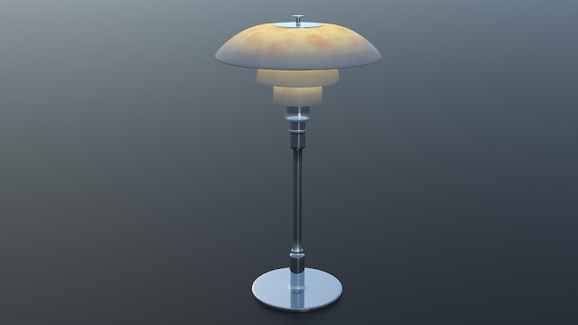
Fig.2: A Lamp. Creating a VRay blend material of a lightmtl and a glassy plastic was key in producing this lit effect. 


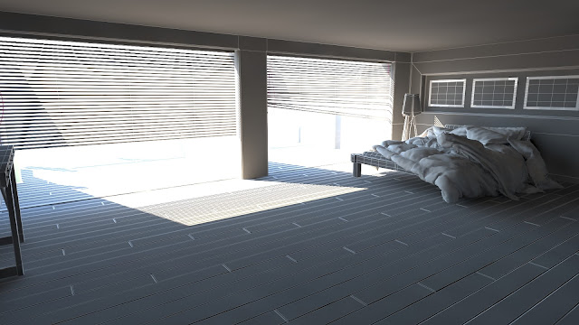
Fig.4 The Room Step One


Fig.5: The Room Step two 


Fig.6


Fig.7


Fig.8

Thursday, 11 February 2016

Interior Visualisations 02: Start Point

As a small side project I've assigned myself the task of creating another interior visualisation. This time we will be working with a swanky bedroom concept and I will be using VRay rather than Mental Ray to render and light the images. 

This post highlights that starting process for the 3DS Max scene, as you can see I've started to block in some basic shapes for the room. What you can't see is that I've carefully created layers for the walls, ceilings, lights and furnishings so that I can move through the scene as efficiently as possible. It pays to keep your scene tidy and maneuverable, especially when you have to hand it over to a colleague or artist. 

Secondly I've also worked with Marvelous Designer in this post to create some awesome bed sheets and pillows. This is a very easy to use program which involved exporting the bed frame to simulate and stitch a cloth over. The major advantage of MD is that it is easy to control the volume of the cloth (via elasticity and compression settings), as well as easily sewing parts of cloth together and making realistic cuts/welds and seams into the cloth.


Fig.1: Snap shot of the VRay Render in progress


Fig.2: Welding seams in Marvelous Designer


Fig.3: Importing the Cloth as an OBJ to Max


Fig.4: Creating volume inside a duvet by adding seams


Fig.5 Extra added elements to create a realistic feel to the bed


Fig.6: The starting point for the visualisation. 


Wednesday, 3 February 2016

Bourbon: Rigging Part 01


Back to Bourbon, my quirky military rabbit character, I've started to build an animated rig for the character. This took some careful consideration of joint placement, as to how he would move. I couldn't just Rig him as I would a homanoid character since this would restrict the movement of the pelvis.
Step one was simply adding all of the bones into the right orient and position and making sure they were 'linked' or parented into each other accordingly. (See the schematic view to the right hand side of fig.1). 


Fig.1 Adding bones/joints to our rig.

The second stop I started to look into the different kinds of IK chain solvers I could deploy for my rabbits rig. See here I've also introduced a knee and foot control to counter animate twists and bends in the IK. 


Fig.2 Adding IKsolvers to the legs

Digital Painting Process and Practice

It's been a while since I last had the opportunity to post my progress with you, as you can imagine work with the New Year has been absolutely mental. 
Never the less I have managed to get around to producing some digital paintings (this time around) during my free time. This is part of an effort to upgrade my existing skills and get to learn some cool new processes for digital painting inside photo shop. 
The general process was to produce an outline of a character, then to give the character a tonal range (orange colour) which we would then adapt into the kind of finish we wanted and add some lighting to. 
My first attempt I decided to pick a sculpture, so I could compare my 'value layer' [or tonal ranges] to the initial photo graph: as close to classic copy sketching as you can get on a digital tablet. 
I learnt that it would probably more beneficial to keep your brush block-like for an artistic and stylised effect, whereas the addition of an air brush sort of smokes the image out.  


Fig.1 silhouette starting point

Fig.2 Value layer (tonal range)


Fig.3 Added bounce light and shadow


My next attempt, I tackled an environment with exactly the same process. I feel this was much more successful partially because by this point  I was getting more used to the handling of my graphics tablet again but also because there is a continuity with the brush strokes and style of the image.
For these exercises I used a chalk brush at 20-50% opacities as well as a smudge brush.


Fig.4 Environment Concept